Support for loud version warning banners #759
Comments
|
This would be useful for NetworkX as well:
We would also like one for old releases that says they are no longer supported. |

|
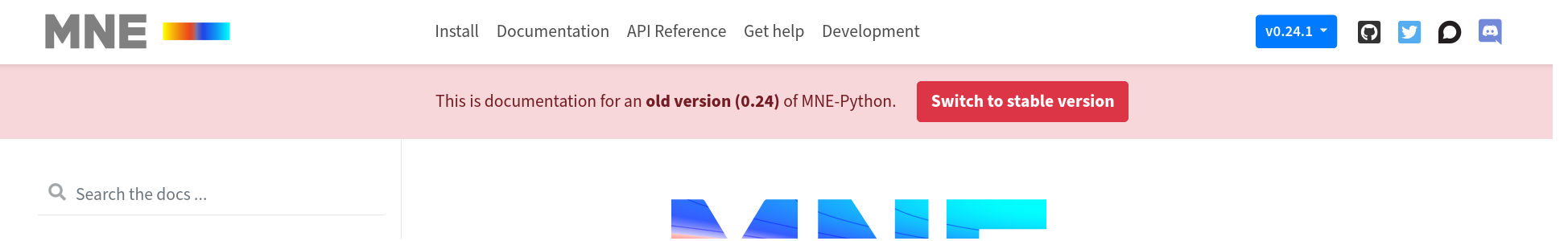
ditto for MNE-Python:
Here is how we do it: |
|
Some quick questions:
|
|
I only put our banner under the header because hell is CSS and that's the best I could manage before giving up on trying to put it above. That said, I think either location is fine. But I do think this is distinct from an announcement. E.g. a fundraising or user survey announcement should appear in addition to a version warning on non-latest versions. |
|
Right so that would be the one downside - you'd use it instead of other announcement text, so you couldn't have both the announcement text and the warning banner up at the same time. Would that be a big problem? Conversely, I am trying to understand if having a dedicated warning banner would be better, but where you can't change it to anything other than the same warning message across all documentation (e.g. "WARNING: You're on an outdated version, click this button for the latest" or something) |
|
Is personally prefer a dedicated version warning banner (that accommodatels old as well as pre-release versions). |
|
I agree that version warnings need/deserve a dedicated banner. For example, ours has some JS that tries to make the link go to the corresponding docs page in the stable version (like what the version-switcher dropdown does). That feature is, I think, something other sites would like too, and something that isn't relevant for the general-case announcement banner. |
|
We do a similar thing in Matplotlib, but it's generated by a script so we can have the redirects point to the same path in the new docs if they're available. |
|
There's an implementation of this that got pretty close but got bogged down in smaller details and then I lost time to work on it. But maybe it would be useful for others to pick up or in case I have more time to try again in the future: |
|
Is it solved by #1354 ? |
|
closed by #1354 |
For the Bokeh docs, we have an extremely loud banner warning any time a user is on either
This banner looks like:
A similar banner with "for a PREVIOUS version" appears when looking at an old docs version.
I know that the docs at Style the Switcher Buttons describe how the switcher entries can be customized based on version. This is great, but after ~10 years of supporting OSS projects, it is also way, way too subtle on its own :) We want a version warning that is loud and un-missable, and also has a call-to-action link to latest docs.
Currently we implement this custom banner with some custom JS:
However, we would like to reduce the amount of customizations that are necessary, and try to move towards only using a stock version of this theme, if possible. Adding support for some kind of loud version warning option would allow us to remove this custom JS entirely.
The text was updated successfully, but these errors were encountered: