Skip to content

feat: add signin button styles #5802

New issue

Have a question about this project? Sign up for a free GitHub account to open an issue and contact its maintainers and the community.

By clicking “Sign up for GitHub”, you agree to our terms of service and privacy statement. We’ll occasionally send you account related emails.

Already on GitHub? Sign in to your account

Merged
merged 49 commits into from
Nov 15, 2022
Merged

feat: add signin button styles #5802

merged 49 commits into from
Nov 15, 2022

Conversation

ndom91
Copy link
Member

@ndom91 ndom91 commented Nov 12, 2022

Changes

  • Changed default provider button styling
  • Added provider svgs and brand colors

Todos

  • Improve default darkmode black button styling

Preview:

next-auth light mode btn preview next-auth dark mode btn preview

Notes

  • If you're involved with any of these projects and we've used your brand colors wrong or anything like that - we encourage you to reach out here and we'll be happy to fix it!
  • Some providers really do provide some strict rules around what they'd like the btn to look like. Here are Google's, for example - developers.google.com/identity/branding-guidelines#incorrect

Sorry, something went wrong.

@vercel
Copy link

vercel bot commented Nov 12, 2022

The latest updates on your projects. Learn more about Vercel for Git ↗︎

1 Ignored Deployment
Name Status Preview Updated
next-auth ⬜️ Ignored (Inspect) Nov 15, 2022 at 4:39PM (UTC)

@github-actions github-actions bot added core Refers to `@auth/core` pages providers style labels Nov 12, 2022

Verified

This commit was created on GitHub.com and signed with GitHub’s verified signature. The key has expired.
chore: rm comments
@ndom91 ndom91 force-pushed the ndom91/login-btn-styling branch from f14e1f9 to eb94c30 Compare November 12, 2022 14:00
@balazsorban44
Copy link
Member

Keep in mind that colors are dictated by the theme, but otherwise this is useful feedback and we will discuss it! Thanks!

@Exerra
Copy link

Exerra commented Nov 14, 2022

I like @Gawdfrey's mockup more as it is more in line with the modern design of Supabase Auth & Auth0.
My suggestions for the redesign are:

  • Make the background a grey-ish colour and remove the border from the login box (will make it look cleaner & for dark mode probably reverse? background is black and the login box is grey-ish)
  • Put the logo inside the login box & make it smaller (sorta like @Gawdfrey's suggestion, but even smaller)
  • Use theme colour for the login button (idk about dark mode)
  • 30px rounding
  • Smaller provider icons
  • Grey border instead of shadow for the provider buttons

@Gawdfrey
Copy link
Contributor

Gawdfrey commented Nov 14, 2022

I made some alterations according to some of the suggestions @Exerra had.
The button background color is controlled by the theme and the button text is controlled by the button text field.
Desktop - 1
Desktop - 2

@ndom91
Copy link
Member Author

ndom91 commented Nov 14, 2022

I made some alterations according to some of the suggestions @Exerra had. The button background color is controlled by the theme and the button text is controlled by the button text field.

I like the mockups a lot in general, however, are you allergic to the standard login button layout? i.e. Left aligned button and center aligned text in the remaining space? 😂 </sarcasm>

@Gawdfrey
Copy link
Contributor

I like the mockups a lot in general, however, are you allergic to the standard login button layout? i.e. Left aligned button and center aligned text in the remaining space? 😂 </sarcasm>

Hehe, did not know that I was allergic of that until today!
I looked at some examples and I have to agree that it certainly looks much better.
Desktop - 7
Desktop - 8

@ndom91
Copy link
Member Author

ndom91 commented Nov 14, 2022

I like the mockups a lot in general, however, are you allergic to the standard login button layout? i.e. Left aligned button and center aligned text in the remaining space? joy </sarcasm>

Hehe, did not know that I was allergic of that until today! I looked at some examples and I have to agree that it certainly looks much better. Desktop - 8

Haha so this is still a bit off imo, you have the text left-aligned to a certain point.

I'd be curious to see your mockup with something like this - where the text is center aligned within the remaining space after taking the image into account.

image

Basically you can make the container flex, with two children - the img and the span with the text. Then you can set the parent to justify-content: flex-start which will push all of it to the left. Then set the span to flex-grow: 1 which will cause it to take up the rest of the space dynamically. Finally, in that span you can set text-align: center. That should do the trick

@Gawdfrey
Copy link
Contributor

Basically you can make the container flex, with two children - the img and the span with the text. Then you can set the parent to justify-content: flex-start which will push all of it to the left. Then set the span to flex-grow: 1 which will cause it to take up the rest of the space dynamically. Finally, in that span you can set text-align: center. That should do the trick

Aah, my bad I misunderstood. Thought you were talking about the "Sign in" button..

Desktop - 7
Desktop - 8

@ndom91
Copy link
Member Author

ndom91 commented Nov 14, 2022

Aah, my bad I misunderstood. Thought you were talking about the "Sign in" button..

Beautiful! 😂

@Exerra
Copy link

Exerra commented Nov 14, 2022

My horrible photoshop skills aside, I feel like making the background a grey colour really helps draw the focus to the login box (+ with no border looks nice and modern 👀).

But that is all I could nitpick from @Gawdfrey's design without going into the accursed realm of designing for dark mode 🥴

githubmockup

@Gawdfrey
Copy link
Contributor

I took the liberty to implement these design suggestions in code as well, with @Exerra latest sketch in mind. I am not allowed to create a pull request, how could I submit the code for review? Fork the repo?

@ndom91
Copy link
Member Author

ndom91 commented Nov 15, 2022

I took the liberty to implement these design suggestions in code as well, with @Exerra latest sketch in mind. I am not allowed to create a pull request, how could I submit the code for review? Fork the repo?

Yeah so thats generally how it works, you make a fork, make your changes there then create a PR from the fork into the main one 👍

@Gawdfrey Gawdfrey mentioned this pull request Nov 15, 2022
3 tasks
@Gawdfrey
Copy link
Contributor

Gawdfrey commented Nov 15, 2022

I added a new PR with the aforementioned designs here.

@raulmarindev
Copy link
Contributor

I like the new design. Thank you all for the work you do in this amazing library.

@ndom91
Copy link
Member Author

ndom91 commented Nov 15, 2022

Last update to this PR, add darkmode button border back

image

@ndom91
Copy link
Member Author

ndom91 commented Nov 15, 2022

I'd recommend move forward with this button logo + provider styling PR here. And then follow up shortly thereafter with another more general pages styling refresh, for example with gawdfrey's PR.

@ndom91 ndom91 temporarily deployed to Preview November 15, 2022 16:00 Inactive
@github-actions
Copy link

🎉 Experimental release published 📦️ on npm!

pnpm add next-auth@0.0.0-pr.5802.b9d39079
yarn add next-auth@0.0.0-pr.5802.b9d39079
npm i next-auth@0.0.0-pr.5802.b9d39079

@ndom91 ndom91 marked this pull request as ready for review November 15, 2022 16:27
@ndom91 ndom91 force-pushed the ndom91/login-btn-styling branch from 6ae5d81 to 51321f8 Compare November 15, 2022 16:37
Copy link
Member

@balazsorban44 balazsorban44 left a comment

Choose a reason for hiding this comment

The reason will be displayed to describe this comment to others. Learn more.

This looks good to me! :shipit:

@balazsorban44 balazsorban44 merged commit 9d962a0 into main Nov 15, 2022
@balazsorban44 balazsorban44 deleted the ndom91/login-btn-styling branch November 15, 2022 16:46
@adrianbienias
Copy link

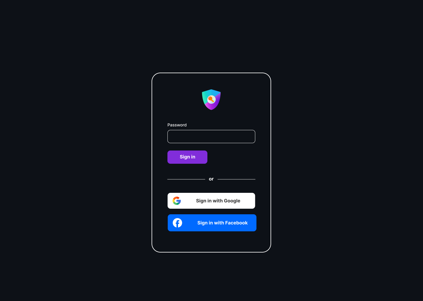
I think a little visual bug was introduced by this PR.

"Sign in" isn't vertically centered.

Screenshot from 2023-03-21 16-42-05

Sign up for free to join this conversation on GitHub. Already have an account? Sign in to comment
Labels
Projects
None yet
Development

Successfully merging this pull request may close these issues.

None yet

6 participants